Web design for law firms: how to generate more clients.
 by Callum Hornigold, Head of Marketing
19.12.2022
The jury is out.
Your hunch is that your law firm’s website needs updating, but you’re not sure whether it’s worth the investment.
Perhaps you’re uncertain about the potential trials and tribulations of a lengthy web design project, or just how much ROI it will deliver anyway.
Well, what if you were able to see just how many potential clients you could be losing from your current under-optimised website?
In this article, we’ll examine the five biggest mistakes in web design for law firms and show you how to correct them.
And we’ll show you how to create a law firm website design that not only looks sleek and professional but also drives leads.
Let’s dive in.
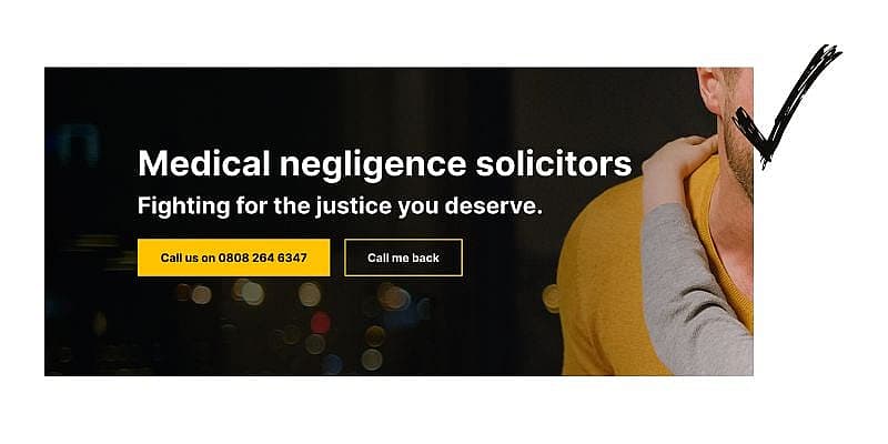
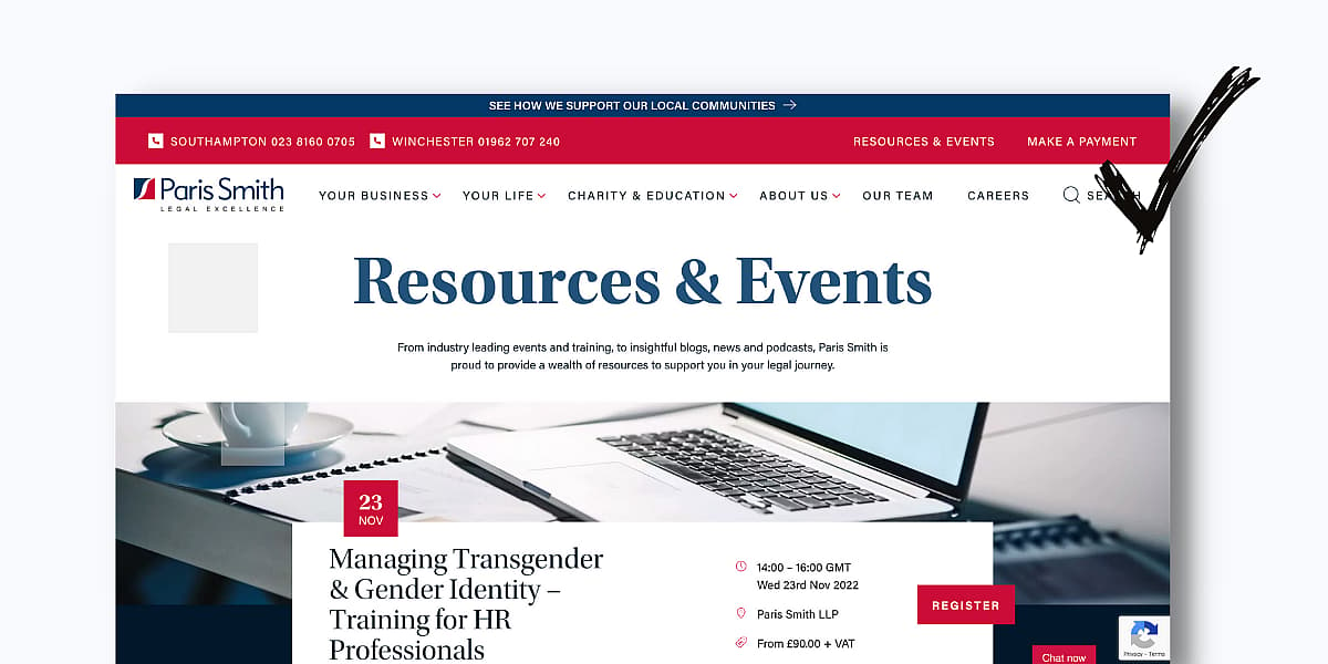
1. Dated design.
In the 22 years we’ve been executing web design for law firms, we’ve found that the law sector is often lagging behind in both design and lead-gen.
Most law firm web designs are about as exciting as a divorce.
Muted colours, not enough conversion opportunities and too much text are all afflictions of a half-baked law website.
How to remedy it:
Use contrasting colours.
Use contrasting colours to emphasise the hierarchy of the visual elements on your page.
Use the 60-30-10 rule when building your site. This consists of:
- 60 percent of your neutral base / dominant colour (E.g. white, cream, or very light grey)
- 30 percent of your secondary colour
- 10 percent of your call-to-action colour.
This can also be flipped by using a dark base colour such as dark blue for dark interfaces.

Avoid stock imagery where possible.
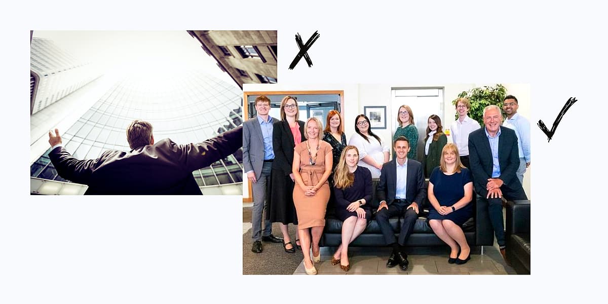
Stock imagery should be outlawed on law firm websites, seriously. (Well, at least bad stock imagery.)
Your law firm should be about you and your clients – prospective clients will sniff out stock imagery a mile off and it compromises the emotional connection with your law firm.
Use real images of your team and office(s) where possible (unless you’re located in a grey concrete building in Slough).
Ensure your team look professional and approachable (smiles never hurt anyone).
Showcase their expertise, any specific areas they specialise in, and any notable cases they’ve worked on.
That being said, that isn’t an opportunity to plaster your face all over the site.
This can often do the opposite effect and make your law firm look cheap, particularly when it’s paired with a poor cutout of yourself.

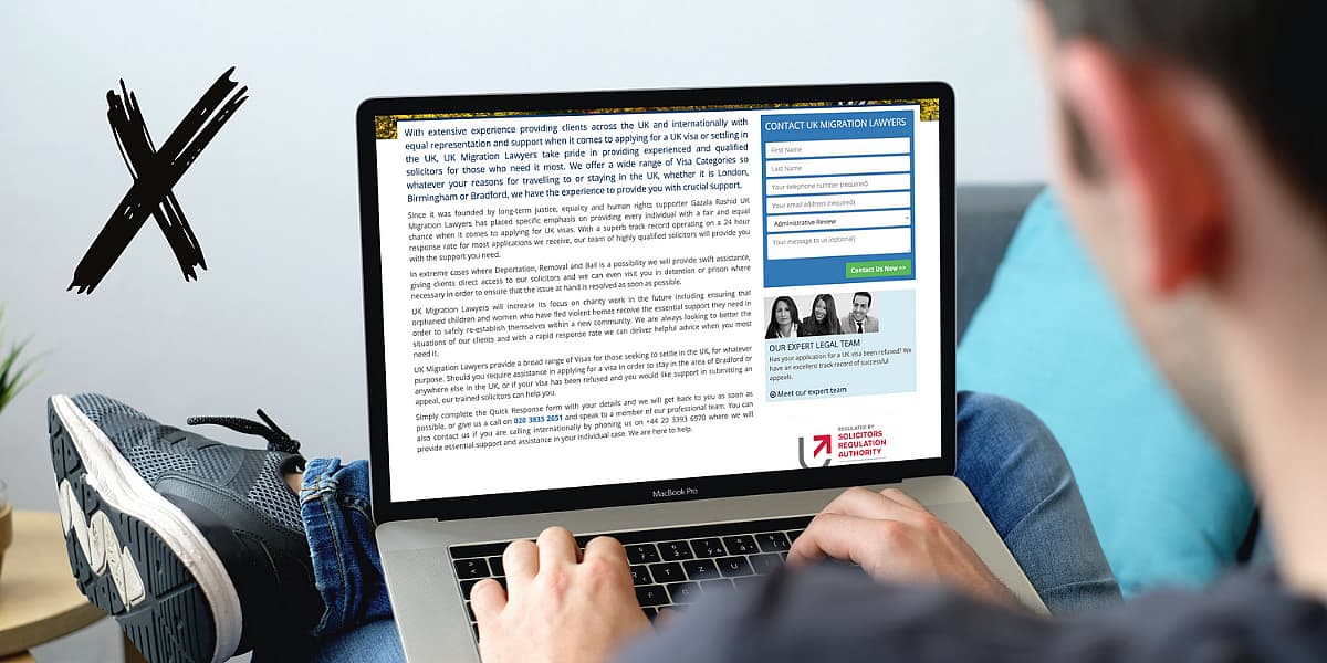
Don’t use too much text.
While having lots of copy on your site can be great for SEO, stacking paragraph after paragraph on your home and service pages will overwhelm your audience.
For larger blocks of copy, break it up with catchy short subtitles and use dropdowns where necessary.
Create depth.
Many law firm websites are static and flat.
Modern web design for law firms leans towards depth.
Create depth by:
-
- Using size and scale
- Overlapping elements
- Layering transparent objects
- Adding texture
- Playing with shadows
Build in microinteractions.
Microinteractions are small design features that interact with you as you navigate a website.
This helps create a more engaging and immersive experience when navigating your site.
Microinteractions can be anything from images changing as you hover over them, to animated numbers that increase when you scroll.
Make for mobile.
If your target audience is primarily individuals rather than corporates, we’d recommend using a mobile-first design.
For private cases, prospective clients tend to search for law firms on their mobile.

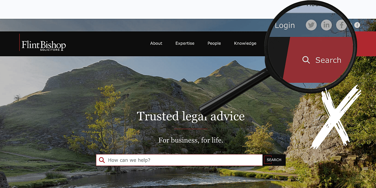
2. Massive menu structures.
Ever been to a restaurant and experienced the overwhelming feeling of choosing a dish from a menu thicker than a stack of lawyer’s legal papers?
The same goes for a site menu. You need to keep it as simple as possible.
This comes down to one simple (yet, conversely, very complex) thing…
…taxonomy.
Taxonomy is how your pages are structured into content silos.
Some examples of optimized URLs include:
https://www.examplelawsite.com/practice-areas/birth-injury-claims
https://www.examplelawsite.com/practice-areas/cerebral-palsy-claims
https://www.examplelawsite.com/practice-areas/hospital-negligence-claims
https://www.examplelawsite.com/conditions/medical-misdiagnosis-claims
https://www.examplelawsite.com/conditions/surgery-negligence-claims
https://www.examplelawsite.com/conditions/cancer-misdiagnosis-claims
How to remedy it:
You need to conduct an information architecture planning session. There are many different starting points, depending on the state of your site / content.
- Identify each audience type (see personas later), what their goals are and the information they need
- Conduct an audit of existing content and work out whether the pages you have serve these information needs. Consider what you are planning to say on these pages – do you need to add pages, do you need to combine pages or split them, do you have pages that are redundant? Once this is done you should have a list of page titles, some new, some needing to be rewritten and some fine as they are
- Create a site plan containing these pages
- Rather than stick everything in the top menu, organise into logical groups based on parent topics
3. Little lead-gen.
The main goal of your law firm’s website is to generate leads.
However, all too often we see missed opportunities when conducting initial website reviews.
There are various ways you can optimise your site to generate more leads.
How to remedy it:
Include a form or CTA at top of your home page.
Make it easy for your prospective clients to contact you.
Instantly hit your audience with a contact ‘Contact Us’ call-to-action (CTA) button, or a Contact Us form at the top of the home page.
Not sure which one to use? Try both.
Consider which type of interaction is most likely to convert into a customer. If you find you land new clients much more effectively if they call and speak to a member, make this your primary CTA. This will typically be in a brighter, bolder block to make it stand out more than your secondary CTA.
If you find people who submit an email or request a callback tend to convert into customers less often than when instantly speaking to a team member, make this your secondary CTA.
Pro tip:
Don’t send your customers to a Contact Us page after clicking a ‘Contact us’ button. It’s much better for it to open a form directly on the page.
Why?
If you’re running ads to that particular page, it makes it much easier to track conversions and measure attribution.
Use call-to-actions throughout your site.
Speaking of CTAs, utilise them throughout your site.
These can be buttons in contrasting colours that drive action or image CTAs that have a button and text.
Ensure these are responsive for mobile, otherwise, the text inside the CTA can appear too small.
Don’t forget to include CTAs in your blog content too.
If you’re targeting organic traffic, you need to convert those readers into leads.
For longer blogs, pepper CTAs throughout the copy – but don’t overdo it.
Bonus tip: Embed a call to action on your dropdown menu. Your menu nav is a place most visitors will click!

Consider chatbots.
Chatbots are great when a prospective client wants instant communication.
Use marketing automation such as the HubSpot CRM that can route chat conversations to the right member of your team.
Being responsive is key with chatbots.
Be sure to create automation that forwards enquiries instantly to another member of the team if the initial team member isn’t available.

Don’t place your social logos at the top of your home page.
Your social media channels should work hard to drive traffic to your site, not the other way around.
Otherwise, you’re at risk of driving them away from your site.
We’ve seen several law firm websites do this.
The worst part:
They’re driving their web traffic to social channels that have poor and irregular content.
Place your social media links at the bottom of your home page.
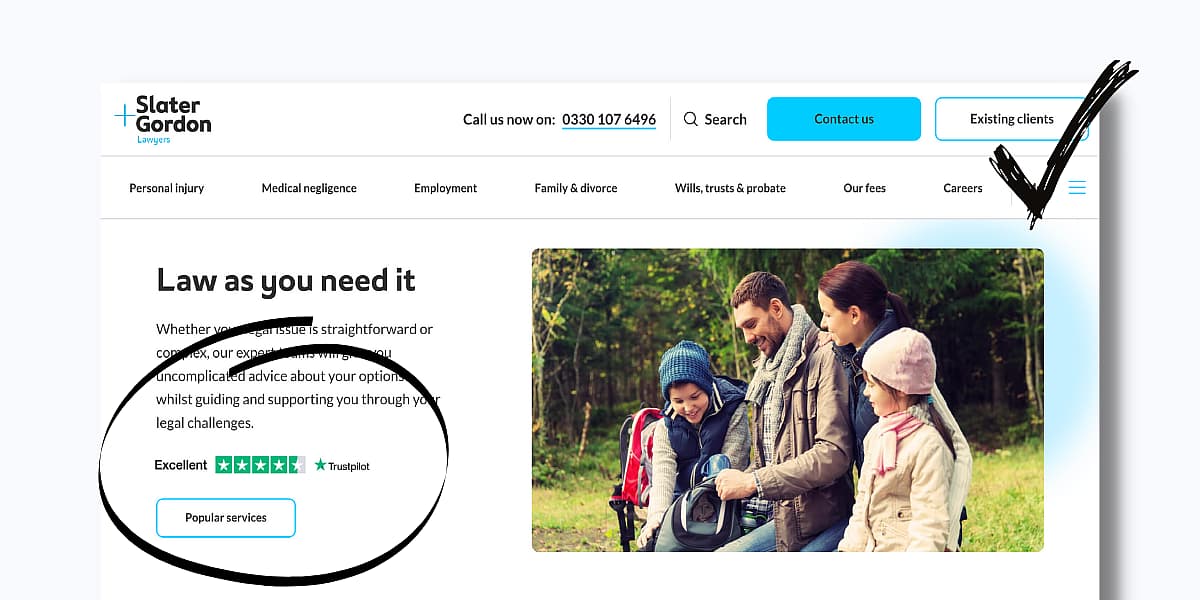
Use social proof.
Social proof builds trust and credibility with your prospective clients.
Include case studies on your site that highlight successful cases.
Include reviews on your home page using third-party integrations such as Trustpilot.
Include testimonials for credibility.
It may seem straightforward, but it’s an area many law firm websites are lacking in.
Engage with video.
Good: Use video to introduce your team and communicate your expertise.
Better: Use video to introduce your team and film testimonials.
Best: Use video testimonials to introduce your team and communicate your expertise using a service such as Vidyard to embed call-to-action buttons at the end of the video so you can track conversion rates and integrate with your CRM.
And remember…
….humanise your law firm!
People want to deal with people – just like them, not people in suits hellbent on stacking cash.
Introduce your team, showcase their expertise, but also show their softer sides.

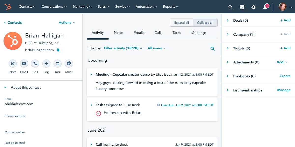
Use a good CRM to track and convert your leads.
Speaking of CRMs, use a powerful CRM such as the HubSpot CRM to track leads and respond quickly.
42% of law firms take 3+ days to respond to leads. Law firms are effectively handing over leads to their competitors with such poor response times.
A good CRM will enable you to:
- automatically create new contacts based on form submissions
- quickly respond to queries via automation or directly from the CRM
- automatically log all correspondence for firm-wide visibility
- call directly from the CRM
- include a meetings function so legal professionals can send calendar links to their contacts to organise meetings
- enable you to qualify and set tasks and reminders to follow up with your leads
- assign contact owners
- measure team performance and success through customisable reports
Drive traffic to your service pages through ads.
This one’s really important.
There are people out there that need your services…
…right now.
They pop in a quick search on Google and the law firms that are advertising come out on top.
If you’re not advertising, you’re getting buried way down the page.
Advertise services that are at a premium to ensure you get maximum ROI on your advertising.
Successful web design for law firms treats your service pages as landing pages, ensuring they’re optimised to convert from ads.
Here’s a quick anatomy of the perfect law service page:
- An SEO-optimised title that ties into the keywords you’re bidding for.
- A primary CTA at the top of the page to get in touch by calling.
- A secondary CTA to request a callback.
- A powerful image (ideally of someone smiling).
- Social proof (Trustpilot reviews, testimonials, awards, relevant successful case studies).
- An intro that includes your keyword.
- Copy that talks to your prospective client (second person).
- If it’s a service page, ensure you link to subservices too (and ensure these pages are optimised to convert too!).
- An outline of the process (empower prospective clients during a time of uncertainty – show them you’re guiding them through the process).
- Frequently asked questions section (based on keyword research).
- Showcase your people and expertise in that specific area.
- Call-to-action buttons throughout that link back to the form once clicked.
- Optional links to blog content related to the particular service.
4. Clueless content.
When speaking with law firm clients, most are aware that content is an important element of any marketing strategy.
However, they often are clueless when it comes to building a content strategy.
They may be producing sporadic blogs on various topics, but with no real direction or consistency.
How to remedy it:
Pillar pages and topic clusters.
Another key method for increasing your search engine rankings is to produce pillar pages and topic clusters.
Firstly, pick the topic you want to rank for.
Let’s take a look at the topic ‘Medical negligence claim’. This would be a solution-specific search term for people who are trying to make a claim.
Choose a keyword with over 300 searches per month, the more searches and the more relevancy the better.
Now, produce a definitive blog that goes into detail on this topic. We’re talking over 2500 words.
For example, ‘Making a medical negligence claim: A definitive guide’.
This could be a guide on picking the process of making a medical negligence claim and how your law firm can support clients through the process.
Use subheadings based on keyword research and the various questions people are asking.
Implement a jump-to menu structure so your audience can navigate to different sections of the pillar page quickly and easily.
Include various Call To Action buttons encouraging people to donate.
Now that your pillar page is built, it’s time to build your topic clusters.
Your topic is ‘medical negligence claim’, so you want to write a set of subtopic blogs that link towards the pillar page via text hyperlinks.
This signifies to Google that your pillar page is an authoritative piece of content (some call it ‘cornerstone content’) and Google pushes it further up the rankings.
You can see an example of a pillar page and topic cluster below:
Pillar page
Keyword – animal charity
‘Which animal charity is right for you? [The definitive guide]’
Subtopic blogs
- How long does medical negligence claim take?
- What is medical negligence in the UK?
- How much medical negligence compensation am I entitled to?
- How to claim medical negligence
- A guide to medical negligence, no win no fee
- How to make a medical negligence claim against the NHS
Include a range of CTAs to convert visitors into leads.

Video.
Content creation is all about using your time wisely.
Repurposing your existing content for other channels is the most productive way to get your message into the hands of potential clients.
For example, if you’re creating a series of topic cluster blogs (as mentioned above), get your team member with specialisms in that particular area to highlight the main points in a video.
Keep ‘em short and snappy (ideally under a minute). Then, distribute it on your social channels.
It may not directly lead to an influx of leads. However…
…over time it builds up your brand and authority and builds trust with your prospective clients.
When clients choose a law firm, they’re often coming to you with a problem they’ve never had to face before – for them, it’s scary.
Guiding them through the process and offering helpful content along the way empowers them and reduces that fear.
Another opportunity is addressing common questions based on your keyword research in video format.
A prime example of this is The Black Belt Barrister, a YouTube channel with over 244,000 subscribers.
Again, this takes time and resources so be realistic about your limitations. However, if you can invest the time and effort, the exposure and rewards are plentiful.

Resources.
From our experience working with law firms, there is often a disparate content strategy.
They have lots of content, but it’s all over the place and hard to find.
Don’t bury your content on your site. Compile it all into a Resources section.
Amalgamate and label:
- Guides
- Podcasts
- Videos
- Webinars
- Blogs
Again, ensure you repurpose content.
Every pillar page you write can be turned into several subtopic blogs.
Every subtopic blog you write can be turned into a podcast episode and a YouTube video.
Every podcast and YouTube video you create can be turned into several social media shorts.
From one pillar page, that’s 120 pieces of content. 120 opportunities to connect with your prospective clients.
5. Boring branding.
Web design for law firms goes far beyond nice colours and clever interactions – it’s about how you communicate your brand too.
Sadly, many law firm websites should be held in contempt with criminally dull branding.
Here’s how to inject some legal va va voom into your law firm branding.
How to remedy it:
Branding isn’t simply what people see on your website, it’s also how people feel about your law firm.
Before jumping into your visual identity, you must have a clear understanding of what makes you unique and relevant to your target audience.
Here are the steps you need to take to develop a storing brand.
Step 1: Internal and external stakeholder interviews.
Interview your internal stakeholders and ask them questions about what they believe your brand is.
Examples could be:
- Why do you think [your law firm] stands out?
- How would you describe [your law firm] to prospective clients?
- Why would someone not want to use [your law firm]
Now interview external stakeholders. This could be prospective clients or current clients.
The purpose of this is to find the disparity between what you think your current brand is, and what your audience thinks your current brand is.
If there are gaps, you need to plug them and reflect this within your website, messaging and marketing material.
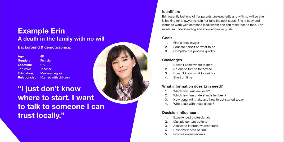
Step 2: Buyer personas.
Buyer personas are semi-fictional buyers/characters based on your research and some educated guesses.
They will enable you to focus your marketing messaging and material towards the direct needs of the people you serve.
At Contra, we often break them down into a series of key questions:
Identifiers
[Communication preferences, personality. How will you engage with them?]
Goals
[Top 3 goals]
Challenges
[Primary challenges and common obstacles]
What information does [persona name] need?
[…to overcome their challenges?]
Common objections
[What hurdles will we face in acquiring them as a customer?]
Marketing messaging
[How will you describe your solution to them based on what you know about their challenges?]
As a law firm, you may have a number of buyer personas. However, they will all share commonalities.
Most of your personas will want to know the following:
- Who will I be dealing with? (your team, expertise and experience dealing with similar cases)
- What is the process?
- When will I see results? (How long it will take?)
- Where are you based? (Do you have localised solicitors?)
- Why are you different to competitors?
- How much will it cost? (Are you no win, no fee?)
Ensure your messaging and content on your website satisfies these key questions, as well as any other more specific needs you uncover when creating your buyer personas.
Step 3: Brand purpose (feeling as well as thinking).
At this stage, you’ll have a good idea of what you do and who you do it for, now it’s time to ask why you do it.
While many assume choosing a law firm is based on logic (reputation, case studies, expertise) it’s also just as much, if not more, an emotional decision.
It’s the ‘why’ that creates an emotional connection with your audience.
A great example of communicating the ‘why’ is Hudgells Solicitors:
“Fighting for our clients. Standing up for the vulnerable. Giving a voice to those seeking justice.”
It’s essential to consider how would you want people to feel. This will influence both your messaging and your visual identity.
For example:
- Safe
- Empowered
- Calm
Now consider what you certainly wouldn’t want your prospective clients and current clients to feel.
For example:
- Worried
- Confused
- Frustrated
Now, your brand should back this up at every interaction you have with your audience.
If you want them to feel safe, use statements such as, “We’ve got you covered. For over 25 years, we’ve been helping people just like you get the justice they deserve .”
If you want them to feel calm, choose a calming colour palette.
If you want them to feel empowered, showcase your team and successful cases.
This doesn’t just apply to your home page. Consider how you want them to feel from the moment they land on your site, right through to the moment they win their case.
Step 4: Brand pillars.
By using your stakeholder research, you can now form three to four distinct areas that make your firm unique and relevant to your clients.
These are often used as icons and text above the fold on the home page.
However….
…don’t just say it, prove it!
Further down the page, you need to demonstrate exactly why these are your brand pillars.
If your customer believes you’re friendly and approachable, use testimonials and Trustpilot reviews.
If you’re highly successful with cases, use statistics and showcase prominent cases.
If you have a national reach, show where your offices are located using an interactive map.
Step 5: Visual identity.
Now’s the time to create your visual identity and there’s a reason you’ve held off until now:
Your visual identity must be based on your customers’ needs.
Everything from your logo and typeface to your colour palette must serve your audience.
For example, if your prospective clients need to see authority and expertise, choose a typeface, logo and colour palette that demonstrates this.
Choosing a serif typeface reflects authority and sophistication. However, a sans serif font can reflect modernity and approachability.
Choosing a red colour palette reflects authority, while a blue/green colour palette reflects trust.
Choosing a bold logo represents confidence.
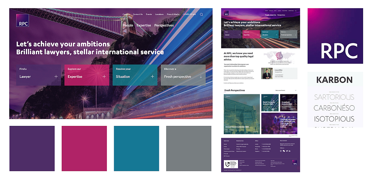
Example:
RPC’s logo uses a sans serif font for modernity and a blend of contrasting bright colours to communicate authority. It’s also placed inside a square as this inspires a sense of trust.
Its colour palette utilises purple to communicate a sense of luxury and prestige.
It also uses sans-serif fonts throughout its website to give a modern and approachable feel.
Free law firm website review.
Successful web design for law firms requires a customer-focused visual identity.
Your website must be easy to navigate and your messaging will speak directly to your audience’s needs with a clear mission and values.
The website will incorporate a range of content to attract, engage and convert your audience, from social proof to blog articles, and team profiles to case studies.
It will utilise a pillar page and topic cluster strategy to drive organic traffic and will be backed by a robust ad strategy, channelling prospective clients straight to the service and subservice landing pages.
At Contra Agency, we’ve helped law firms attract, engage and convert leads through powerful web design and modern law marketing strategies.
If you’re ready to grow, get in touch for a free website and marketing review now.
What's holding you back?
At Contra, we’re committed to identifying exactly what’s holding your law firm back and how we can generate more clients. Start now with your free website and marketing review.
 by Callum Hornigold, Head of Marketing

